
Grey, Oversized, and Still the Best Hoodie I’ve Bought This Year
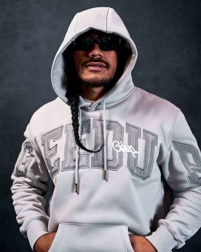
Not gonna lie, I almost skipped past this one. Grey Geedup hoodie, big block letters, hood up in the photo I’ve seen a hundred versions of this exact setup from a hundred different brands. My first reaction was basically “cool, another one of these.” Then I actually looked closer at the lettering and changed my mind pretty fast.
The First Thing That Actually Got My Attention
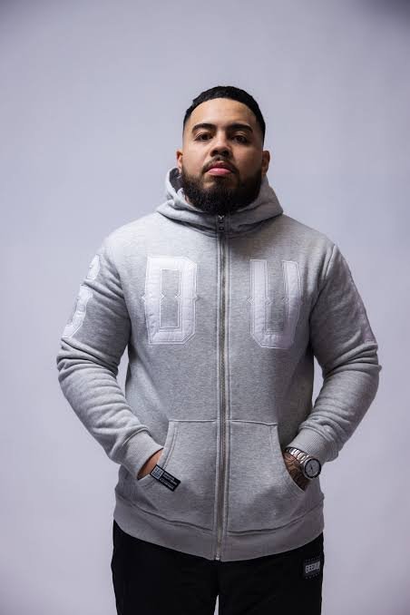
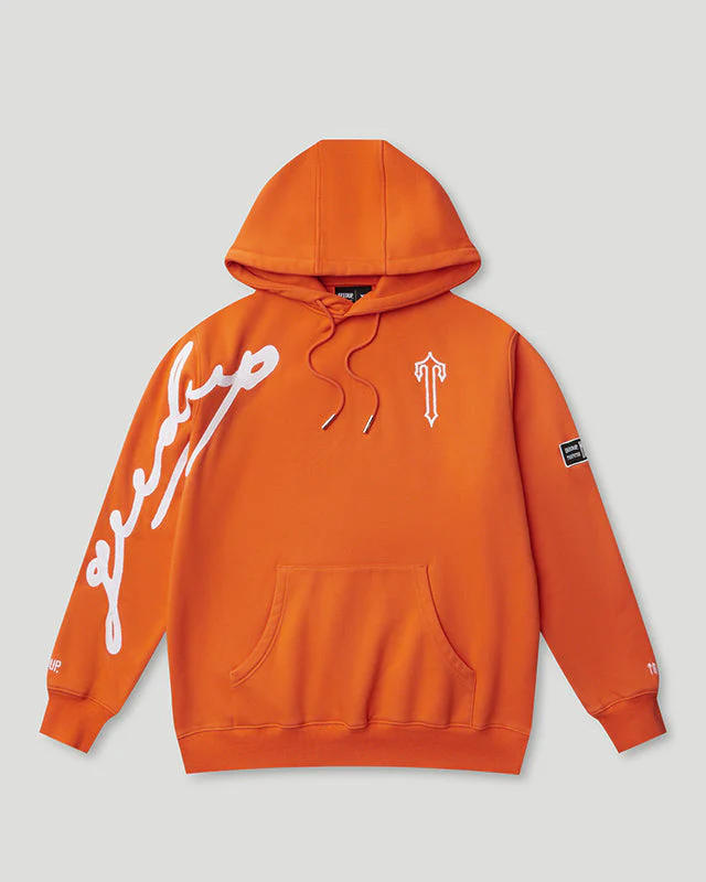
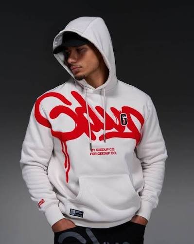
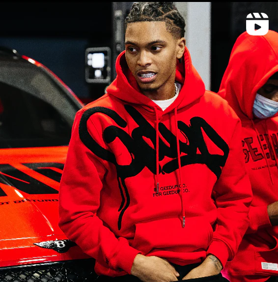
So the “GEEDUP” text across the chest is huge. Like, takes up most of the real estate on the front, wraps a little onto the sleeves too. Normally when a brand goes that big with a logo I roll my eyes a little, because it usually just looks like they’re compensating for a design that doesn’t have much else going on. This one’s different though, and I think it’s because of the colour choice more than anything.
Why the Grey-on-Grey Thing Actually Works
It’s tonal. The lettering’s basically the same grey family as the hoodie itself, just with enough shading and outline to separate it from the base fabric. So instead of a bold contrast thing like a red logo popping off a grey background you get this subtle, almost monochrome effect where the size of the text is doing the work instead of the colour. I keep going back to that because it’s the whole reason this piece works for me. A massive logo usually needs bright colour to justify itself. This one skips that entirely and just leans on scale and texture. Kind of ballsy honestly, and it pays off.
Fabric and That Raised Lettering
Touched the lettering itself out of curiosity. There’s actual texture there. Not flat print. Feels closer to embroidery, or at least a heavy raised print, which gives it depth you don’t see in the photo. Doesn’t come through great on camera, but in person it’s obvious. Fabric-wise thick. Properly thick, not “marketed as heavyweight but feels like a t-shirt” thick. You put this on and immediately know it’s not cutting corners.
The Fit, Because That’s What Sells This Whole Look
Fit’s boxy. Wide through the shoulders, doesn’t taper in at the waist much, built for that architectural oversized look a lot of guys are doing right now instead of the slouchy baggy thing from a few years back. Different silhouette, more structured somehow even though it’s still huge. The hood’s a whole situation on its own. Big. Like, genuinely big, enough that pulling it up basically frames your entire face the way it does in the photo. Not a hood that just sits flat and useless when it’s down you can tell it’s meant to actually be worn up, styled that way on purpose. Sleeves run long. Past the wrist. Standard at this point across basically every oversized drop from every brand, so not really a surprise, just noting it.
Why the Hood-Up, Sunglasses-On Look Suits This Piece
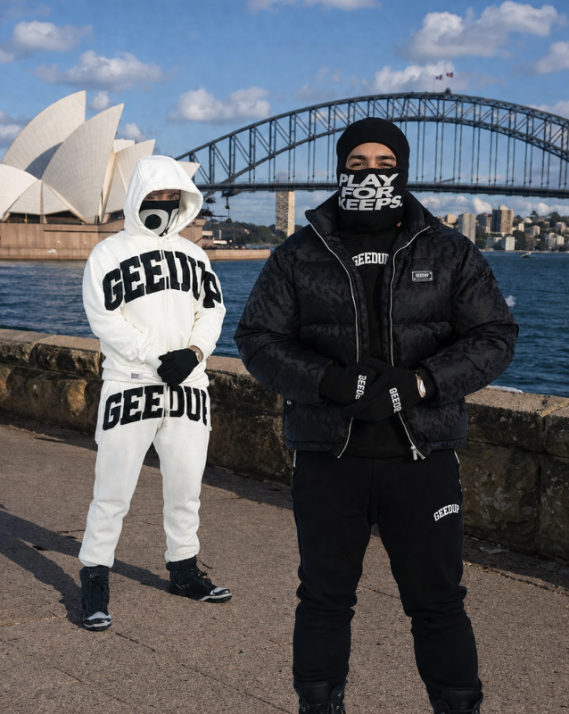
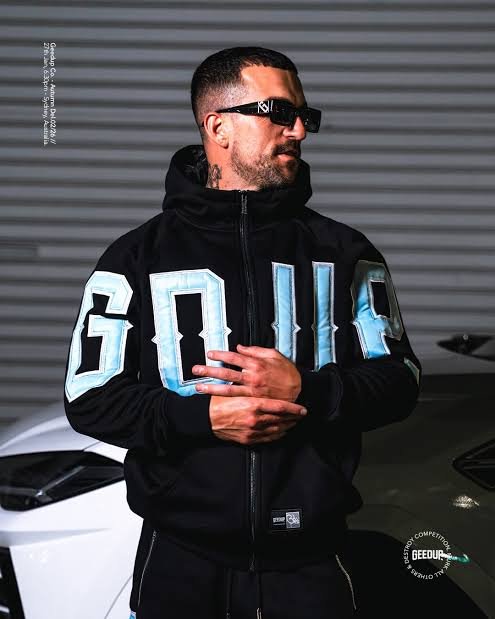
Now the thing about wearing the hood up with sunglasses I get why that’s the styling choice here. Face half hidden, all the attention on the fit and the graphic. It’s become this whole aesthetic lately, guys wanting that slightly anonymous look where the clothes carry the identity instead of showing much face. And this Geedup Hoodie fits right into that because of how oversized the hood is and how bold the chest logo reads even from a distance. Not every hoodie pulls that off when you throw the hood up. Half the time it just looks like, well, a hoodie with the hood up. This one turns into a whole look.
How I’ve Actually Been Styling Mine
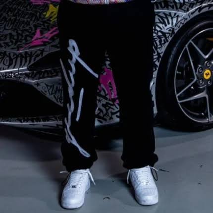
Cargo pants most days, usually black, sometimes grey because I’ve apparently given up on colour entirely this season. Sneakers stay muted too white, grey, nothing loud, because the hoodie itself doesn’t want competition from bright accents. It wants you to stay in that same quiet lane it’s already working in. Haven’t layered over it yet. Might once it’s actually cold, but so far it’s handled some chilly days fine on its own, which says something about the fabric weight honestly.
Where Geedup Fits Into the Bigger Streetwear Picture
Less chaotic graphics, less Gothic detailing, more of that gym-meets-street thing going on. Big block letters, structured fits, leaning on scale rather than busy design. This hoodie’s a pretty clean example of that whole approach. And yeah, there’s a following behind it at this point. People comparing colorways, arguing over which drop’s better, the usual stuff that happens once a brand’s actually built something instead of just catching one viral wave and disappearing.
Is It Actually Worth the Price
Price-wise I was a little unsure going in, streetwear pricing can get weird sometimes, feels like you’re paying for hype more than product half the time. But holding this, feeling the weight, seeing the texture on the lettering up close, it didn’t feel like just a name tax. Can’t speak to how it holds up a year from now yet, haven’t had it that long. No pilling so far though, no cracking on the print, stitching’s all still tight.
A Few Things Worth Knowing Before You Buy
If you’re thinking about grabbing one true to size if you want that boxy look from the photos. Size down if you want it a bit less swallowing, though you lose some of that structured shape doing that. And the grey reads better in person than in pictures, for what it’s worth. Photos flatten it out a little, make it look more one-note than it actually is. Also, don’t sit on it too long. Pieces like this Geedup Clothing move fast once people start posting fits, and restocks aren’t a guarantee with brands operating like this.