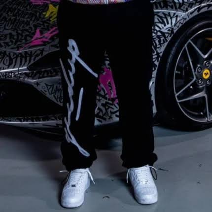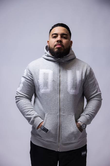

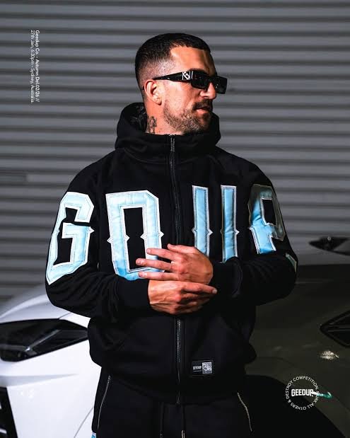
So I saw this photo the other day. Guy in sunglasses, black zip-up, huge icy blue letters running down his sleeve, some kind of car half-visible behind him in a garage. Nothing fancy about the setup. And I just… stared at it. Longer than I want to admit, honestly. That’s geedup clothing in one image, basically. Not loud in the way you’d expect. Not trying too hard. It just looks better than everything next to it and doesn’t seem to care that you noticed. I’ve been meaning to write about this brand for a while now. So here we go.
The Sleeve Thing Is The Whole Point
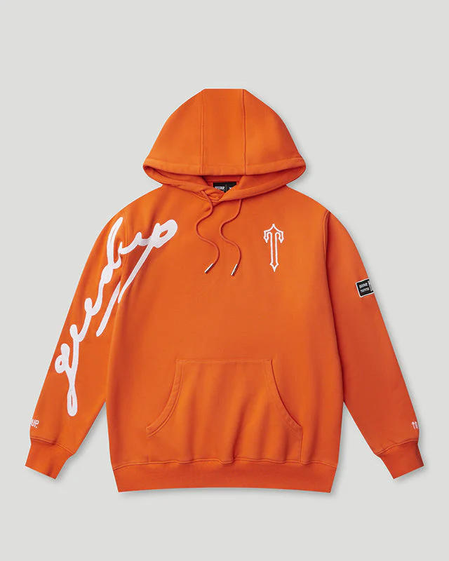
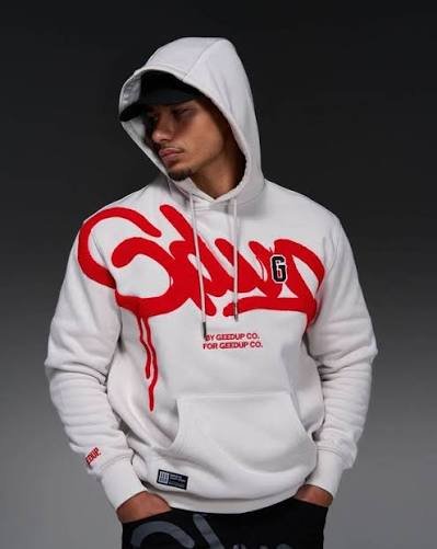
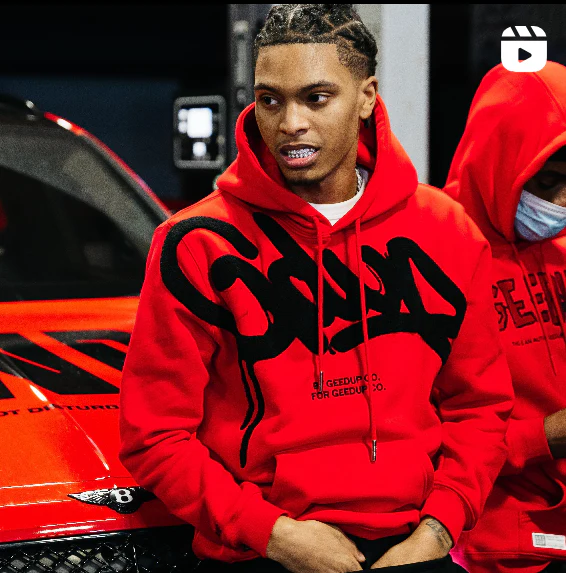
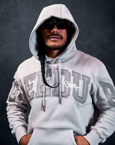
Here’s what most brands get wrong. They tuck the logo somewhere small a little chest patch, a tag you’d miss unless someone points it out. Geedup said forget that. The letters go straight down the arm. Big, chunky, kind of varsity-jacket-meets-something-meaner. Icy blue bleeding into white, hard black outline holding it all together. Either this works or it’s a disaster, there’s no in-between with a design choice this loud, and somehow it just… works. I don’t know how else to put it. You see a geedup hoodie once and you know it forever. That’s not something I can say about most streetwear brands, if I’m honest. Half of them blur together in my head after a while.
It Actually Holds Up Outside A Photoshoot
This part matters more than people think it does. A hoodie that only looks good in studio lighting isn’t worth much. Heavy fabric. There’s a small tag near the bottom hem, nothing flashy, doesn’t compete with the sleeve for attention. Throw it over a plain white tee and honestly you’re done. That’s it. No second layer, no extra effort, nothing to overthink.
“Geed Up” Isn’t Just A Name
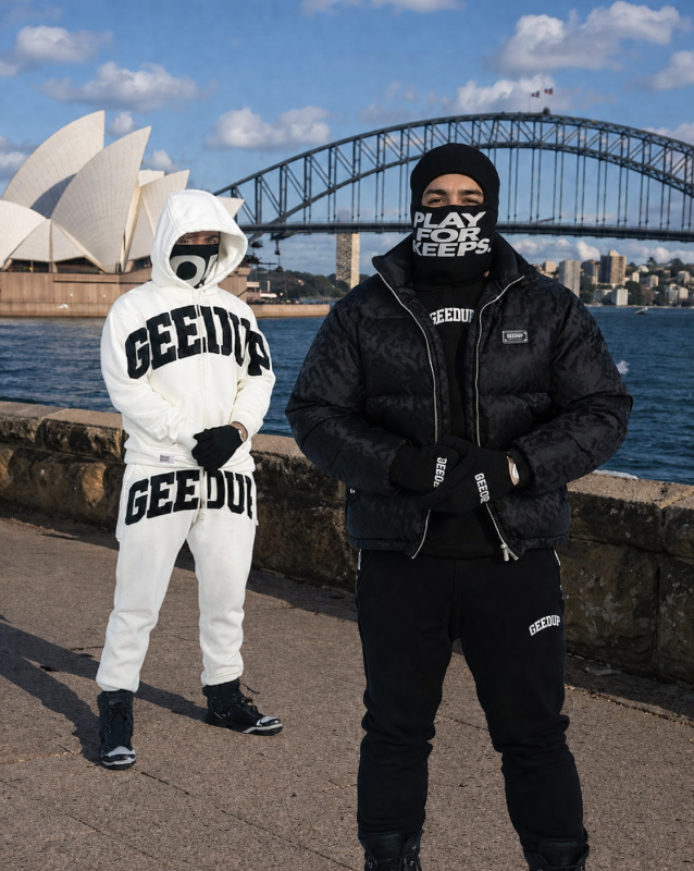
Every decent streetwear brand ends up with some phrase attached to it that people say without even realizing they’re quoting a brand. Geed up does that. It’s Australian, through and through, and you can feel that in everything the fonts, the colors they pick, how the pieces get shot and styled. It’s not chasing the usual American streetwear formula. It’s doing its own thing off to the side, and that’s probably why it’s been leaking into other countries lately too. People notice when something isn’t just a copy of what’s already out there. You wear geedup and it says something without you having to explain it. Isn’t that basically the whole goal of good design? You shouldn’t need a caption.
It Works With Almost Anything, Which Is Rare
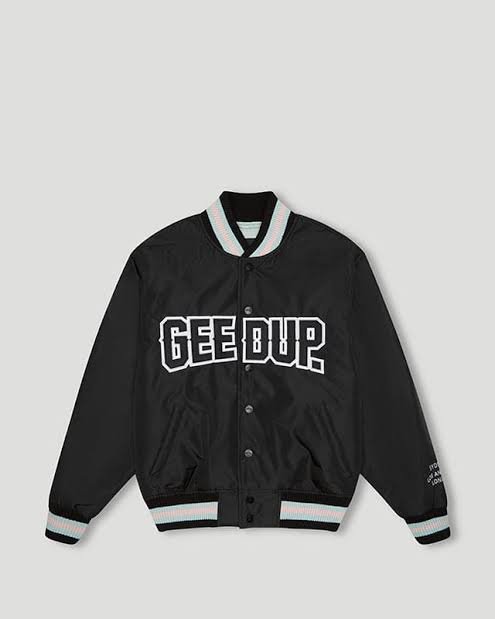
Some hoodies lock you into one specific look. Baggy jeans only, certain sneakers only, a whole aesthetic built around one piece. Not this one. Straight-leg denim, clean white sneakers done, looks put together without trying. Or go full tracksuit if the matching bottoms are in stock (worth checking, the set together is honestly better than the hoodie alone). Cold out? Layer it under a bomber jacket. Warm out? Wear it open, let the sleeve graphic do its thing. That flexibility is underrated. Pieces that only work one way get worn twice and then just sit there.
Okay Let’s Actually Look At The Design Details
I want to slow down here because a lot of this gets missed at a glance.
The Colors
Icy blue on black really shouldn’t hit as hard as it does. Most brands play it safe white on black, maybe red if they’re feeling bold. This combo feels colder somehow. Sharper. Almost metallic depending on the light. Which, not surprising, is probably why it photographs so well and ends up everywhere online.
The Font
Chunky. Bold. A little rough around the edges, like it’s been through something rather than printed clean off a machine. It reads more handmade than corporate, even though obviously it’s not.
How I’d Style One, If You’re Asking
Keep everything else simple. That’s really it. The sleeve is already loud enough on its own don’t fight it with five other logos or busy patterns elsewhere in the fit. Neutral bottoms work best. Black joggers, grey sweats, dark denim, whatever, doesn’t matter much as long as it’s not competing for attention. Sunglasses help, not gonna lie. There’s something about the whole vibe that pairs naturally with that low-key, doesn’t-explain-itself energy. Not required. Just completes the picture if that’s the direction you’re going. Sneakers, keep them clean. White, black, something muted. Let the hoodie be the loud one in the room.
Why It Keeps Selling Out
Scarcity here feels real, not manufactured. Drops are actually limited. Once a colorway’s gone, it’s gone no quiet restock three months later pretending it was always coming back, which some bigger brands definitely do. That’s exactly why people move fast when something new drops. Nobody wants to be the person who waited a week and missed it. And look, I get skeptical of “limited drop” marketing as much as anyone, but with geedup it genuinely tracks the production runs are small, so the scarcity isn’t a trick.
Final Thoughts
Geedup earned its spot the actual hard way. Real design work, not shortcuts, not copying whatever’s trending. The bold sleeve lettering, that icy color combo, a fit that somehow works with almost everything in your closet already it adds up to something that actually stands out in a market where half the pieces look identical to each other. If you’ve been sitting on the fence about a geed up hoodie, stop waiting on it. These runs move fast. Colorways can disappear within days, and restocks aren’t a guarantee the way they are with the bigger, less interesting names in this space.